First impressions mean everything. That is how I feel about Gateway Signs more commonly known as State Welcome Signs. The approach to a sign, the design, the messages chosen, and the images tell us what the state values. We can feel it. They tell us we have hit a milestone, or we have arrived. The welcome sign is a hint of how visitors will be treated. Some states care about us and some not so much or maybe they just don’t know how to show it.

No matter how small a state there probably is more to say about it than the sign can fit in such a tiny amount of space. Some value history (Mississippi- Birthplace of American music), others promote the state flowers (California - Poppy) or popular songs (Alabama- Sweet Home Alabama).

A few offer practical information. Kentucky, announces the Governor and North Carolina informs us that it is the most military friendly state. Some respectfully recognize the indigenous lands (Oklahoma- Native America). A handful love Lincoln (Illinois-Land of Lincoln) (Kentucky- Birthplace of Lincoln) and (Indiana- Lincoln’s boyhood home).


Some use the space to announce laws (NJ- Lights on- Wipers on). Some use cultural languages (Louisiana- Bienvenue en Louisiane). Some clutter up their signs (Maryland) with just about everything you can imagine on it.

Some states have obviously had professional branding advice with catchy slogans where the illustrations typically fit in with the landscaping (Utah- Life elevated) and (West Virginia- Wild and Wonderful) (South Dakota-Great Faces Great Places).


Others want to make us happy. (Pennsylvania- Pursue your happiness) (Nebraska-The good life) (Virginia is for lovers). Ohio promises to find whatever we lost. .


Sometimes a sign might be welcoming although the environment surrounding it contradicts. Why is that port-o-potty right next to the welcome sign? (South Carolina) Why are some signs so small and almost hidden? (Washington) (Oregon)


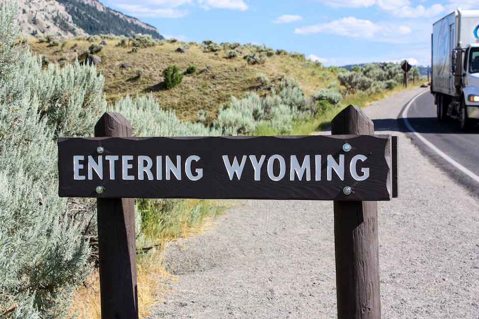
A number of states are polite enough to invest in an exit sign. Often, they are back-to-back signs welcoming us one side and thanking us for visiting on the other. (Oregon-Come back soon) (Leaving Kansas- Come again) (New Mexico- Hasta la vista). Some share a welcome sign with an exit sign from a neighboring state. (Montana and Wyoming).


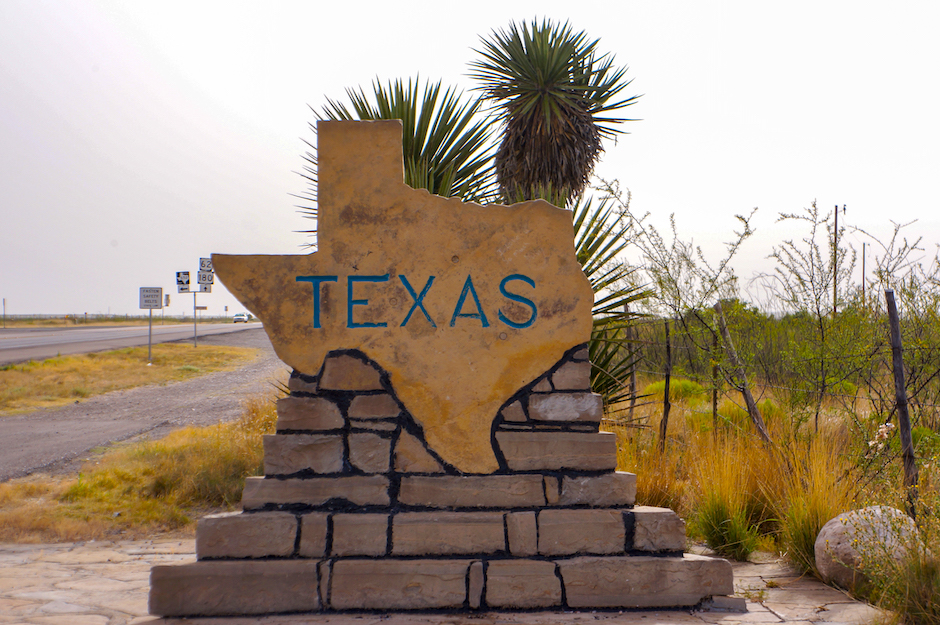
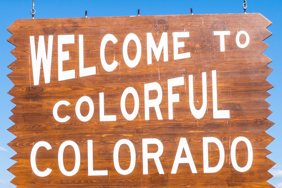
I prefer the signs that are timeless, authentic iconic roadside attractions such as Colorado’s hefty rustic wood signs and the Texas’s big stone sign shaped like the recognizable state. They offer a hospitable first impression that reinforces their purpose and frame our experience.

Tips when Collecting Photos of Welcome Signs
- The best state Welcome Signs are on major roads.
- Get the camera ready when you start seeing exit numbers counting down to 3-2-1. You will be crossing the state line soon.
- Look all around. The side of the road or overhead, on bridges while crossing a river.
- For drive-by photos take multiple shots.
- Want to pose for a photo? Choose places that have safe spots to pull over.
- Capture the surrounding landscape for context.
